Amazon - The curved arrow beneath the Amazon logo looks like a smiley, but is actually an arrow, pointing from the A to Z. This signifies that they sell almost everything from A to Z.
Mc Donald’s - When the company was started they actually meant 'M' not 'Mc.' According to BBC, as the time passed, people recognized the logo as “symbolism of a pair of nourishing breasts.”
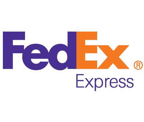
FedEx - In this logo, if you look closely then you will find an arrow between the E and the X, which signifies that the company is always looking to move forward.
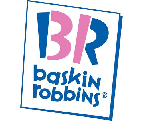
Baskin and Robbins - They offer 31 different flavours of ice-cream and by looking at the logo closely you will definitely find this piece of information in the logo.
Do you have something interesting you would like to share? Write to us at [email protected]